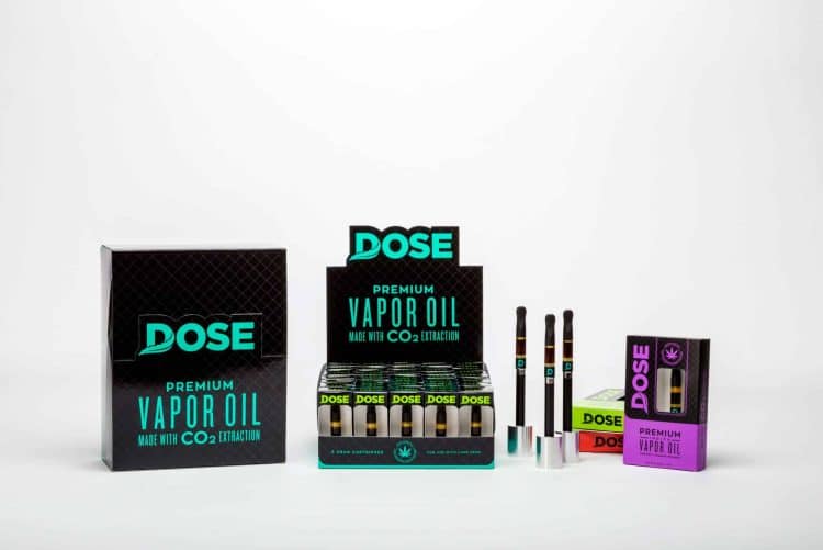
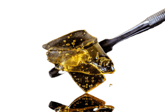
PHOTO AND DESIGN CREDIT TO OMD AGENCY – ONLINE MARIJUANA DESIGN
You worked hard to develop an amazing product, and now you’re ready to take it to market. You need packaging. But don’t underestimate the importance of your packaging and the experience it provides. If it is ugly, weak, and doesn’t function, your sales will reflect that. When a consumer looks at your packaging and picks it up, they are feeling your brand. What do you want it to say?
First let’s get this out of the way. In it’s simplest explanation, packaging is used to seal and protect the product, identify what it is, who you are, what your brand is about, and ultimately get the consumer to purchase your product. It could be a container, a label, a box, or all three.
With legalization of recreational marijuana happening in more and more states, and Canada on the verge of it, there is more brands and products to come. This means more competition. It is easy to see how increasingly competitive the world of consumer packaged cannabis products will be. When the shelves start filling with similar products, this is where your packaging really needs to stand out from the rest.
Remember that every extra millisecond a consumer spends looking at your packaging increases the chances of a sale. You catch their eye, they pick it up for a closer look, they like what they see and feel, and you just made a sale.
When printing your labels or boxes, there are a number of ways to represent your brand in your packaging. Creating something memorable and different will lead to more sales and stronger brand recognition.
Lets explore three of the main ways to create stellar packaging here. The right Paper, a unique Die-cut or shape, funky Finishing.
PAPER / BOARD / LABEL STOCK:
This is the first step in your brand extension. Luxury brands and products should lean one direction, and rustic and hipster should lead the other. Luxury could go Velvet soft touch black, and rustic might want a rough recycled kraft board.
.
Premium brands should always go with a thicker paper and label stock. Thicker labels and packaging gives the perception of higher quality and better made which would match the higher price point of a luxury product.
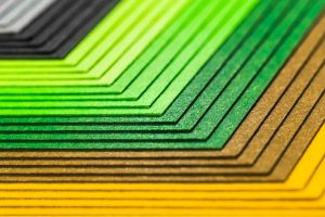
Along with colours and different weights or thicknesses, you can also get into textures. Rough and rustic textures, soft touch and silky smooth textures, classy linens, and everything in between. Again, your paper selection needs to be an extension of your brand. Are you farmer grown and rustic, or are you luxurious and expensive, or something timeless and classy?
DIECUT / SHAPE:
Be different. Just because all the other boxes from your competitors have a square box doesn’t mean you have to.
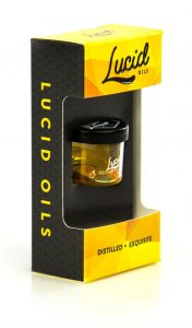
Try some cut outs that reveal something through them. Maybe it peeks at the product inside, or maybe it just reveals a bright pop of colour.
Try some curves or angles. This will help create something really unique which will stand off the shelf and likely sell better. If you create something really cool, you might also receive some free PR through online blogs and social media. Do it for the Insta…
PHOTO AND DESIGN CREDIT TO OMD AGENCY – ONLINE MARIJUANA DESIGN
PHOTO AND DESIGN CREDIT TO OMD AGENCY – ONLINE MARIJUANA DESIGN
Standing out on the shelf increases your chances of the consumer picking up that packaging and having a closer look. Then they will feel the soft touch or thicker paper, or whatever texture and paper you went with. They like it, it’s cool, they buy. See where we are going here?
FINISHING:
So you have selected a thicker paper that matches your brand identity and feel. Then you added a cool cut out in the dieline to stand out and be different. Now lets add some of the real fun stuff. Lots of different ways to go here, but lets look at a couple of the most common.
Emboss, Deboss, you the boss:
These can be used to add some really cool features that the customer will love feeling once they pick up the carton. They can create textures and help form unique patterns that match key brand elements, or they can be used to show block text or logo’s in a unique way.
Raised areas can also be created with specialty high build spot coatings which can also create a high gloss effect. Double contrast.
Foil, make it shiny:
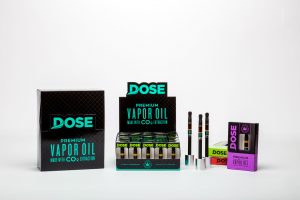
Gold, Silver, Blue, Green, Black, whatever you want. Foil can be used to help a logo, product name, or design element reflect store lights and catch the consumers attention. Or you could use different colours of foil to highlight different skus of the same type of product. Foil can also be used to portray luxury and a higher perceived value.
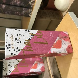
PHOTO AND DESIGN CREDIT TO HIRED GUNS CREATIVE – HIRED GUNS CREATIVE
Something really unique: Use your imagination….
There are so many ways to create really unique packaging that helps sell your product. Some of them can be costly, others can be done cost effectively. But please do something special, something different. Your product sales will thank you!
If you have any questions about print marketing and packaging, feel free to fire them my way, I’d be happy to help. [email protected]
Dave Hopkins – Print Design Academy :
Dave is a Print and Packaging professional with a huge passion for helping people create incredible packaging and print marketing. He lives in Vancouver, BC with his wife and three children. He is also the host of PrintCast: The Graphic Design for Print Podcast and the co-founder of the soon to be launched PDA: Print Design Academy. You will find him taking pictures of cool packaging while grocery shopping, or in line at a craft brewery for a growler fill.
